Social Justice Usabilathon
A 12-hour “hackathon” style usability competition hosted by MITRE. The overall objective was to devise a solution that enables active collaboration from different stakeholders for Mitre’s Social Justice Platform website.
Background
MITRE created a social justice platform website (sjp.mitre.org) which aims to be a resource for decision-makers by providing data, tools, and framework that address social justice challenges and enabling collaboration on solutions to those challenges.
Goals
Enable users to do the following:
- Upload content that is relevant to the topics being addressed on the site
- Suggest new content that is discoverable within the navigation structure of the site for a particular social justice topic
- Moderate content that is posted
- Engage in active collaborative work via tools and data available on the site
Target users included MITRE administrators, academic researchers, government agencies, data scientists, and communities impacted by social injustice.
Method
For this challenge, our team split into two teams – design and research. The design team created:
- Rapid personas to understand who our target users were
- Empathy maps to visualize what we know about the target users
- Journey maps to identify how users would interact with the resources.
The research team focused on:
- User interviews with SME.
As part of the research team, I conducted interviews exploring users’ motivations, needs, and challenges in engaging with a collaborative website.
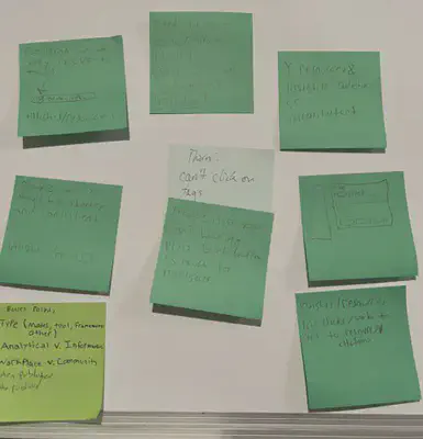
Afterward, the two teams came together and, using post-it note brainstorming, we identified potential pain points that needed to be addressed and began to form a pen-and-paper wireframe.
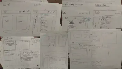
Next, we evaluated the initial wireframe through further user testing, identifying areas of confusion. We created a low-fidelity prototype that improved our initial wireframe, which was evaluated during the second iteration of user testing. This final iteration provided insight to improve our product before a 10-minute presentation.
Overall, we were able to understand the pain points of our different users and design a prototype that mitigated these frustrations. Additionally, through user interviews, we strategically incorporated a community feature to personally contact resource contributors and enhanced flow efficiency for moderating resources.
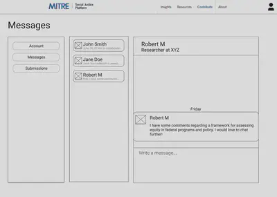
Final Prototype
Allow users to actively engage in community messaging
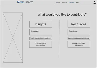
Provide initial contributions page with concise descriptions of relavent jargon
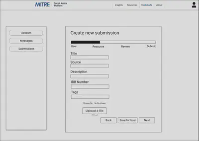
Create a clear new submissions page with progress bar and easy to use input boxes
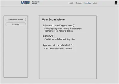
Clearly communicate submission review process
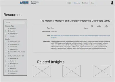
Highlight related resources for efficient information acquisition
View the final Figma prototype by clicking here
Recommendations
- Clearly define distinctions in jargon.
- Highlight relevant content in close proximity to the resource.
- Categorize user submissions under review.
- Create community interaction through direct messaging and reactions to resources.
Lessons learned
- 12 hours goes by quickly!
- Spend critical time to plan and adhere to a timeline.
- Overestimate the time required and adjust accordingly.
- Delegate interviewing and taking notes to effectively listen to users.