Exploring UX of mHealth Chatbots

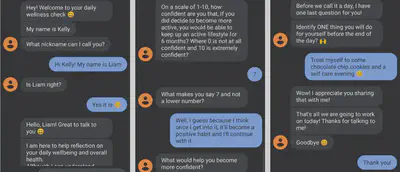
An individual research project exploring emerging user experience themes relevant to two well-being chatbots - one of which I created. I identified 10 emerging themes relevant to conversational features, functionality, and responses.
Role: lead researcher
This project is part of the journal article: User Experiences of Well-Being Chatbots published in Human Factors click here to read full article.
Background and Goals
University students face economic and accessibility barriers that limit the self-management of healthy lifestyles and healthcare resources. This issue is exacerbated for those from disadvantaged sociodemographic backgrounds who may go without stable internet to access well-being support. One tool designed to improve healthcare accessibility is well-being CAs. CAs have addressed mental health support in the general population but have yet to address physical well-being support and accessibility to those in disadvantaged socio-economic backgrounds where healthcare access is further limited.
Thus, the current research explored emerging themes relevant to the users’ experiences of a SMS-based conversational agent (CA) and a similar, commercially available smartphone application, Wobot.
Method
For all 19 participants, I conducted concurrent think-aloud usability testing to identify novel emerging themes relevant to the individuals’ experience in engaging each chatbot. Interactions were recorded and then transcribed for further analysis. Participants completed initial demographic surveys, interacted with one CA while expressing their thoughts and feelings aloud, completed a post-interaction survey, then proceeded with the second CA and post-test surveys.
Main findings
- Ten emerging themes were identified across both chatbots.
- All participants expressed contrasting experiences relevant to their ability to freely respond or have guided options.
- More specific behavioral questions led to more perceived accountability.
- Participants enjoyed the option to choose and focus on one health domain at a time.
- Calibrating expectations of the CAs’ capabilities early led to more positive experiences.
| Theme | N Participants (%) |
|---|---|
| User Response Modality | 19 (100%) |
| Question Specificity | 15 (78.9%) |
| CA Response Time and Length | 14 (73.7%) |
| Conversation Flow Control | 11 (57.9%) |
| Perceived CA Role | 10 (52.6%) |
| Digital Images and Imperfect Punctuation | 9 (47.4%) |
| Repetition | 8 (42.1%) |
| Task Immediacy | 7 (36.8%) |
| Calibrated Expectations | 6 (31.6%) |
| Bi-directional Communication | 2 (10.5%) |
Quotes of Interest:
User Response Modality (Free vs. Guided Responses)
- “Being restricted to no choices, just the one to continue forward, it can feel limited”
- “It’s like I’m playing some character, just tapping through the sequence … the responses are not what I’d respond with”
- “Creating my own answers is faster than having to read a list”
- “I’ve never had questions like that where I could be free with my answers … it’s really cool”
- “It feels like I’m genuinely typing the message to someone back and forth now who genuinely wants to know the answer”
Question Specificity
- “Really surprised with them asking why I rated myself with a score of 7 instead of 5 … it’s making me have a reason why … more motivating”
- “I enjoyed it a lot more because of how many specific questions it asked … it took my attention back”
- “Some of these questions are stumping me, not gonna lie … it’s trying to get you to realize that the changes you want to make are attainable”
- “It feels like it’s adapting and learning what I’m saying to it”
CA Response Time and Length
- “It has the text message delay that people are used to for texting, but it still sends it fast but even seeing the three dots pop up is reassuring to people who text a lot.”
- “A bot to message is sending all the responses immediately. I know I have time to read it but I guess spacing it out might make it feel a little more realistic.”
- “The fact that it’s not all one paragraph makes it part of the realism.”
Practical Recommendations
In relation to users’ response modality, include a simultaneous mixture of free text and guided responses to allow users the freedom to respond while giving examples of what the CA is expecting
Calibrate users’ expectations in the first initial interaction. For example:
- System capability and limitations
- Level of input from the user
- Amount of interaction expected
Consider the needs and characteristics of the target users and the expected perceived role of the CA for positive interactions
My learnings
- Compare applications using a within-subject design to identify user preferences that would not be found from singular application interaction.
- Fully utilize and follow up on users’ body language - users can’t help expressing frustration and confusion through facial expressions.
- Sometimes the insights are only common sense after observing the frustrations